JUNE 1, 2010
Online at last
 A week ago I started organizing and writing my presentation for the UCDA Design Education Summit in Lawrence, KS.
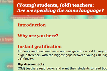
Every day since, except for Memorial Day, I spent at least four hours on it. I wanted it online as a web page or site, so I set up a plain vanilla HTML page and began typing an outline. I gave almost no thought to how it would look, figuring that would evolve out of the content itself.
Today that evolution had to emerge from the ocean of my unconscious and take its place on the dry land of the internet. Wasn't painful at all. Because much of my information is drawn from an online survey, I used a screenshot of the survey results as the background. A couple simple filter effects in Photoshop and I had an interesting graphic.
The design isn't dramatic or artful, but I hope its understandable and attractive. As is my usual practice, when building it I tried to incorporate a new trick or two. In this case it was creating rollover effects using CSS sprites rather than javascript. Pretty simple.
But it's been a very long day, and although I'd like to keep adding material to the site I'm going to declare it done instead. We'll soon see how it plays in Lawrence. Take a look: Young Students, Old Teachers: Are We Speaking the Same Language.
Top |
|
![]()
