Towpath run
 After doing my part for my brothers & sisters by volunteering for a focus group at our union (AAUP—American Association of University Professors) office, I drove a short way to the Cuyahoga Valley National Park Canal Road Visitor Center.
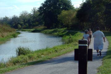
The Towpath Trail which runs through the park is my second-favorite natural spot to visit, after Edgewater Park.
I walked south for a half mile, then ran for about 4-3/4 miles more. This was about a mile more than my typical Edgewater run, and I felt it. The last half-mile or so was pure slogging along.
The trail, which curves frequently as you see here, is perfect for that. You pick out a goal, like "run to the next curve" which looks pretty doable. When you get there you pick another goal—"run to the big tree on the right"—and so on. I actually ran a bit longer than I planned because I didn't recognize the Visitor Center on the way back. I thought it was a different landmark which was my "absolutely positively" last goal.
Jogging along the gently curving trail on a sunny afternoon reminded me of the Monon Trail that I ran on when I was in Indianapolis. A former railroad right-of-way, the Monon runs straight for longer distances, making for less interesting views. I'll take the Towpath any day.
 It was hot, especially the sunny sections. The sun was fairly low in the sky at 5 pm, but the temperature was in the mid-80s. It was reassuring to see most of the leaves still on the trees, still green.
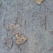
I took this picture standing right underneath a big tree, and you can see there are hardly any leaves on the path. In a couple of weeks they'll probably cover it. We haven't had that first hard frost that turns the leaves red and gold.
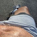 Before getting back in my car to drive home I sat on a bench and soaked up the sun. Looking down at my sweaty abs I was visually reminded that I'm about 5 pounds too heavy, most of it right there. Not the view I'd like to see.
It's not that I don't exercise—I walk quite a bit and run about three days a week. But I have a weakness for snacks: an ever-present bag of pretzels in the car for rides to and from work, and every night I hear the siren call of ice cream or yogurt and granola. If I could only learn to ignore them...he says, having recently slurped down the last of the Moose Tracks. Oh well.
Top |
|
![]()
The Holy Grail?
I'm pretty sure that what we call "interactive media" now is going to look exceedingly boring and primitive in ten years. I always tell my students—because it's true—that one of them might be the person who transforms the medium, the Sergei Eisenstein of interactive media.
So I'm always looking for something, someone, who brings humanity and emotion into a medium that's great at presenting information and showing eye-candy, but not very good at touching our hearts. A Google Alert led me to a blog with a link to Erik Loyer: Eloquent interactive media.
This guy gets it.
His stated goal is to use "motion, semantics, narrative and music to explore the ways in which digital interactivity enables human eloquence."
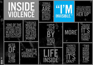
Of the many projects on Loyer's site, I was most impressed by Public Secrets which tells the story of life inside California womens' prisons, mostly in the words of women themselves.
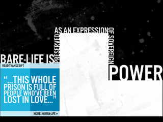 The project has very strong and simple graphics that force you to concentrate on the words, which you can listen to or read.
Loyer uses a simple, elegant, effective animation that appears behind the text box that you've just clicked on. This may seem like just eye candy, but it's not. I know from experience that when you're playing audio on-screen, peoples' attention wanders after a few seconds if there's nothing new to look at. I've seen this with several of my own projects that rely on spoken words.
Loyer's animated blue lines that you see at left serve as a progress bar that shows how much you've heard and how much remains, while adding visual interest to an otherwise static "page." It keeps your attention without distracting, no small achievement.
 I'm also impressed that by avoiding the obvious use of the womens' pictures Loyer keeps our focus on their words, their stories, and their voices. I've heard it said that the human voice is our most unique characteristic, and I believe it. Public Secrets is about voices.
As you can see, the typography and design is spare but dramatic, as good an example of "less is more" as you'll find.
There's a subtle organic look to the background that balances the geometry of the grid and type while adding an implication of violence. Very prison-like.
All in all, with this piece Loyer delivers on his promise of "eloquent interactive media." I look forward to more great work from him.
Top |
|
![]()