Too simple?
 Yesterday I complained, with some justification, I believe, about the overly clever design of a website.
Cute but confusing buttons, sliders and other interface widgets made it hard to understand.
Today's example is the other extreme. Go to IFTTT.com and you're greeted with a big ol' blue button.
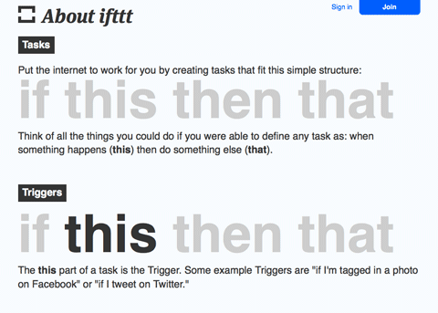 Click the button and you get a big ol' explanation of how the site works.
Because the goals, functions, and I suspect target audiences of the two sites are so different there's no way to do an apples-to-apples comparison.
Still, you couldn't ask for a better example of two totally different approaches to web design.
Which do you prefer?
Take a look at IFTTT.com and SlaveryFootprint.org and let me know what you think. Use the "Comments" box below.