Watch out for the wolf!
 One of the more interesting parts of the Intro to Visual Communication class that I teach is each week when students put their work up on the wall and we talk about it.
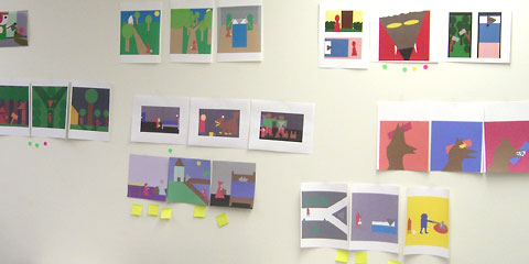
Here you see most of the finished Multi-Frame Story assignments. Students read a fairy tale—in this case LIttle Red Riding Hood—and use basic geometric shapes to tell the story in three or more panels or frames.
Often we'll vote for our favorite. In this case, the story near the center with five Post-It notes under got the most votes for how effectively it tells the story. The small round red and green dots are votes for those that use the multi-frame format most effectively.
This assignment requires that the students both select the right part of the story—including just those details necessary to get it across—and use color, shape, size and other variables effectively. As you can see, most stories succeed in one aspect but not necessarily the other. The small image on the homepage for today shows one that got multiple votes for both storytelling and using the format well, no easy feat.
For more information on this storytelling project, see Visual Storytelling and Multi-frame Story on the class website.
Top |
|
![]()
Cool & girly
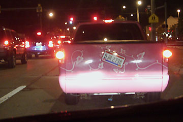
 I hope I see her in the daytime so I can get a better picture. This is one of the coolest—and most unusual—custom paint jobs I've seen on a truck. No flames, swooshes, American flags, stripes, or any of those more mundane designs. This pink and white curly leafy viney thing is a refreshing change of pace.
I took this picture at Pearl and York Rd. on the way home from school, so there's a pretty good chance I'll see her again. I'd like to find out who came up with the paint scheme.
Top |
|
![]()