Watch out!
 Stopping behind a utility company truck carrying a large and no doubt very heavy piece of equipment, the pattern on the back of the vehicle gave me a very strong message to stay away. No words were necessary.
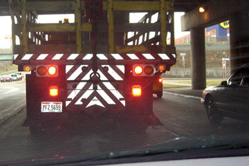
Why? What is it about diagonal lines that say "pay attention"?
Most basic art and design books discuss this, as in this quote from Visual Communication: Images with Messages, by Paul Lester: "Diagonal lines have a strong, stimulating effect in a field of view... Several diagonal lines within a composition create a nervous dynamic energy."
You're not surprised by that, are you?
You—and all of us—automatically react to diagonals in this way, which is why anyone creating visual communication soon learns to take advantage of this tendency.
The website of the Tuscaloosa City Schools offers this suggestion for "Capturing the Readers' Attention": Tilt an image or a block of type at an angle. It's no secret. Look around at ads and product packaging and you'll see this trick used frequently.
Human response to diagonals is true across cultures and locations, so there must be a reason related to something very significant. Like, say, survival. It turns out that many, if not most, of our responses that might be considered "esthetic" have a basis in biology and sociology, in our evolution as creatures and societies. I'm not going to go into detail here, but I highly recommend the slim book called Primer of Visual Literacy by Donis A. Dondis. This explanation of "Balance" starts to explain why diagonal lines attract our attention:
The most important psychological as well as physical influence on human perception is man's need for balance, to have his two feet planted firmly on the ground...Equilibrium, then, is man's firmest and strongest visual reference, both his conscious and unconscious basis for making visual judgments...
So the horizontal-vertical construct is the basic relationship of man to his environment. (p. 22)
In the next section an entry on "Direction" explains further:
The horizontal-vertical reference...is man's primary reference in terms of his well-being and maneuverability.
...Diagonal direction has particular significance in direct reference to the idea of stability. It is the opposite formulation, the most unstable directional force and consequently the most provoking visual formulation. Its meaning is threatening and almost literally upsetting. (p. 46)
Thus diagonal lines disturb our preference for horizontal-vertical stability. We get a little jolt that says: "Uh-oh... could be trouble!"
So we pay attention.
If you'd like to learn more about visual communication and you live in the Cleveland area, sign up for VCD1110, Intro to Visual Communications at Cuyahoga Community College, or see my website IntroVC.com.
A fascinating and somewhat related podcast I found when researching diagonals and visual communication discusses synesthesia—the experience some people have of perceiving numbers as colors, i.e., when they see a "5" it's green. This section alone is worth listening to, but later Dr. Ramachandran extends his theories to "The Science of Art" and "Laws of Aesthetics." It may seem pretty far afield from the truck that stopped in front of me on Ridge Road, but it's all about exploring the mysteries of why we respond to what we see in generally predictable ways.
The podcast and others that look equally good are at the Science & The City website.
Top |
|
![]()