 Color my world
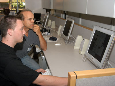
Here's what my work environment looks like. All of our computer labs have gray counters, gray walls, gray carpet, and dark blue or dark red chairs.
Our Apple computers are either silver or some variation of white, clear and silver.
We're discouraged from putting things on the walls (posters, student work, etc.) except where there's a bulletin board.
This environment provides very little energy, and actually this is pretty typical of rooms throughout the college. They're as neutral as they can make them.
What if...


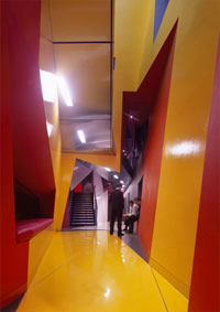
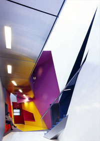
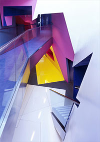
...we worked in a space that looked like this, the Centre for Film & Media at Birkbeck College in London, England?
Can anyone not think that the energy bursting from the building itself would energize everyone in it?
This project was created by Surface Architects, whose glowing, changing website is not nearly as easy to use as I'd like, but nonetheless clearly tells the story of the firm. They are not afraid of color. Why are we?
This story inspired by LivelyGrey, a blog about color. Be sure to look at the amazing Ronald McDonald house in Holland that uses color and whimsical shapes to help kids get better. The architect was Austrian Friedensreich Hundertwasser, who's not afraid of color either. And why are we, again?
Top |
|
![]()