Ouch!
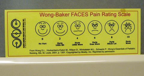
 Here's an example of terrific visual communication that I noticed as I was waiting in an exam room today at the doctor's office.
The faces, highly stylized and exaggerated, clearly represent a range of answers to the question "how much does it hurt?"
This description of how the scale was developed in the early 80s by Donna Wong, a nurse, and a child life specialist named Connie Morain Baker says that the goal was to help young children—often burn victims—who had difficulty explaining how they felt.
Wong and Baker worked with over 50 children, asking them to draw faces representing the range from "no pain" to "the worst pain they could imagine." They used the then-popular "smiley face" stickers as a starting point.
 They got drawings like these, showing a wide range of detail in the faces.
A professional artist later created the simpler faces for the scale. The artist created more variations among the eyebrows on the faces but otherwise used what the kids created.

 Other verbal or numeric pain scales—like these examples from Intelihealth.com—may provide clearer distinctions between levels of pain, but in my view the FACES scale is a great example of the design principle "less is more."
Top |
|
![]()
Tremont scene
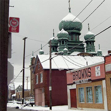
 This view of the ornate domes of St. Theodosius next door to Browns Food Market in Tremont is one of the things I love about city life. All types, side by side.
I rewarded myself with a cappuccino at Lucky's after my visit to the doctor.
Top |
|
![]()