Web Association meeting
Despite an inconvenient snowfall that slowed rush hour traffic, the Web Association meeting at CSU tonight was a good way to spend a couple of hours. I'd made it our class assignment for tonight's Web Publishing class and was disappointed when quite a few students didn't show up. I'm sure the snow scared a couple away, but I also think there's the "I don't go into the city" factor that I've heard from students on a number of occasions.
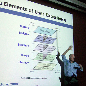
 The presenters talked about how overall site planning and structure relates to the user experience, starting with Jesse James Garrett's diagram seen on the screen here. (You can download the complete diagram from Garrett's site.)
The discussion got pretty academic for a while, then turned practical as the folks who designed SlavicVillage.org bravely offered their site up for critique. There was quite a bit of back and forth conversation about how and why they did things the way they did, but I was disappointed that the speakers didn't offer too many specific suggestions for improvement.
The next victim, Storehouse Tea Company was praised for its elegant design, but criticized for "mystery meat navigation," a description invented by Vincent Flanders and used to describe navigation that doesn't immediately show what it's about. The typical scenario is a group of images or icons that don't show any descriptive text until you move the mouse over them. Other aspects of the Storehouse site were problematic as well in terms of making it easy for the user to buy what he/she wants.
If there had been more time I was going to offer this site to be reviewed, and am sure I'd have been crucified for the horizontal scrolling on the homepage. Because I want to create a timeline effect I'm sticking with it for now, but have been trying to come up with a better way to accomplish what I want. I know that many people hate to scroll sideways and some probably don't even realize that's a possibility.
Top |
|
![]()