Webbiest?
We had a great conversation last night in the Web Publishing I class. I showed a couple of websites that have undergone transformations recently to talk about how things are moving from Web 2.0 towards Web 2.5, if not Web 3.0.
The poster child for this movement is the current (April 2008) site of the Boston ad agency Modernista! It doesn't look like any agency site you've ever seen. In fact it doesn't look like a website at all. You're seeing it live below. (Click here to open it in a new window)
In the view of my students, Modernista's new site is either:
The Webbiest of Webby
or:
A Blood-sucking Parasite on the Back of a Dog
In class we use the term "webby" to describe features and capabilities that are unique to the web as a medium, things that can't be done in print. This includes the obvious (sound, motion, video, etc.) as well as things that we take for granted, like our ability to instantly access a world-wide database about virtually everything. The most mundane but essential capability of the web is the ability to link directly to information anywhere else on the web, transforming the traditional footnote/bibliography into a live network.
This live connection is making communication bi-directional or multi-directional. In the past, when you read a book (and I love books, by the way), you had no way to respond, other than to write a letter and send it c/o the publisher. Of course email—itself a huge part of the internet—has speeded up the process, but it's still pretty cumbersome.
Things have changed. Websites like Amazon.com very early on made it easy for anyone to share his/her feedback with the author and the world at large. Now it's hard for me to imagine buying anything without checking one of the many sites that include product reviews. Last summer we chose a B&B in St. Petersburg, Russia largely based on comments from travelers posted on TripAdvisor.com, and when we returned I added my comments and photos to help the next traveler.
Once you get people used to adding comments it's only a short step to websites entirely made up of what's called "user-generated content." A few familiar names are YouTube, Flickr, MySpace, and Wikipedia, but there are many, many more. The site itself is primarily a framework that holds information (video, music, writing) put there by users. In turn, other users can add their responses and/or their own new content. These are often called social networking sites.
 Social networking and community-based websites are a huge part of the sea change in how we communicate that the web has brought about.
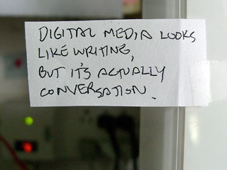
This difference between print and web is summed up in a quote taped to my computer, from a presentation called Control by Khoi Vinh.
Which in a roundabout way brings us back to Modernista!
Why doesn't it look cooler?
People sometimes assume that PIcasso painted distorted faces and Mondrian did rectangles because they couldn't do any better. But of course both could paint quite lovely realistic work, thank you very much. Picasso painted Dora Maar au Chat and Mondrian Composition with Yellow, Blue and Red because they had other ideas, not because they lacked the skill to do what everyone else was doing.
So in case you think the folks at Modernista can't do a spiffy Flash website like all the cool shops do, take a look at their site in May 2007 (thanks to the Internet Archive Wayback Machine). But they've abandoned the fun graphics and animations designed to show how cool they are, for what Wikipedia calls a "siteless" site.
The "siteless" look says to me they've decided to put their money where there mouth is in terms of the web. If user-generated content and social networking are what people love about the web, Modernista has embraced them with open arms. When you click the "About" link you're taken to either a Wikipedia entry about the company or their Facebook page. The portfolio of their work is provided via Flickr galleries. "News" takes you to a live Google News search for "Modernista."
To me, this makes sites like that of competitor Grey Group—a very iTunes-like "coverflow" animation—look dated and derivative. This look, like Modernista's 2007 site, is a nicely rendered version of something we've all seen before.
The new Modernista site can't be accused of that. As it says at the top: Modernista! is not for everyone. So while a good number of my students were appalled at what they saw as a lack of creativity or worse (parasitic!), I think we're looking at the first of many sites that will more tightly integrate Web 2.0-type content into their own.
Things are starting to get interesting...and webbier.
Top |
|
![]()