Engaging, interactive space(s)
 Taking advantage of the sunny afternoon yesterday I walked down to the Cuyahoga River via Superior Viaduct. As I passed Spaces Gallery I decided to stop in, and it was well worth my time.
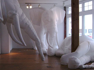
The first thing that caught my eye was a life-sized tableau of two elephants standing watch over another lying on the ground. We've all heard that elephants mourn their dead, as these stark white behemoths seem to be doing.
The elephant sculptures, by Billie Grace Lynn of Coral Gables, Florida, were made of cloth and inflated by small fans—like the snowmen and Santas people put on their front lawn around Christmas. Rather than seeming tacky and cheap, somehow the impermanence of these materials made the scene all the more tragic.
In a small room off the main gallery something that looked like a control panel faced three video screens. The installation by Claudia Esslinger, called The Synergy Project, kept me fascinated far longer than the minute or two I've come to expect of such experiments.
I used the controls on the monitor to try different combinations of videos on each of the screens, sometimes similar, sometimes very different.
After a short break while the staff fixed a technical glitch (the audio wasn't working because someone had turned the speakers off) I returned and added different sounds to the mix of images. I did calm and peaceful combining water videos with the sounds of seagulls and quiet ambient noise. I tried clashing images and harsh electronic sounds.
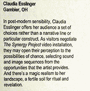
 The label on the wall talks about post-modern sensibility, negotiating the installation, and opening [visitors'] perception. In my experience, phrases like this usually mean you're in for something confusing and/or boring, sometimes both.
In this case the label didn't lie: there really was a magic realism to her landscape.
In part it's because the technology stayed in the background—it quietly did its job (once the speakers were turned on). The user interface was dead simple: three sections arranged like the three screens showed thumbnail images for video and had descriptive names for sounds. You clicked on the image you wanted and it immediately appeared on that screen. You could use a slider to speed up or slow down the video. Below the thumbnails you clicked on the name of the sound you wanted to hear and could use a vertical slider to adjust its volume.
I asked and was told that the software used was called Isadora, and was developed by media artist Mark Coniglio of the performance group Troika Ranch. Best of all it runs on a Mac and is priced very reasonably for something this powerful. I've downloaded a free demo copy and see a project coming out of this, maybe something for next year's Ingenuity Festival.
Top |
|
![]()