Free money
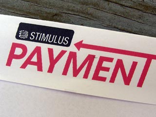
 When I saw the envelope in today's mail my first thought was "where's a graphic designer when you need one?"
I ripped it open expecting to see a check for $600, only to be disappointed by a letter telling me that soon I would be getting a check for $600.
It's not really important that the logo on the outside looks like a student's first typography project. When the subject is something we're very interested in— like free money, for example— there's no need to make it look pretty.
Probably the best examples of this are the full-page ads for diet pills, plans, creams, etc. that run in newspapers and magazines. They're mostly text crammed onto the page with a few poor-quality "Before" and "After" photos. But they work because many people are desperate for a magic solution to their weight problems, and these ads promise that in large print. No fancy design needed.
Old + new
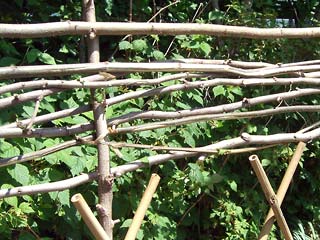
When my daughter lived in Chicago's Wicker Park neighborhood I remember seeing low fences made from twigs woven together on someone's tree lawn. As I looked at the bamboo fence I'm using instead of tomato stakes in the garden I realized it needed to be higher, and the tree-trimming I'd done the other day gave me just what I needed to make my own woven fence top.
 As I laid the thin branches between vertical stakes I realized that it wasn't going be as easy as I thought. The darn branches were unruly, popping out of place when I let go instead of staying nicely on top of each other.
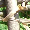
My solution was to add a modern twist (sorry): I attached them with twistees that came with the box of garbage bags.
 I know it's cheating to do it this way, but it's the best I can do. Maybe there should be more vertical sticks, spaced closer together. How did the pioneers do it?
Top |
|
![]()