Learning design, learning software
 Today I spent most of the day with Eric Chimenti and faculty and students at Chapman University in Orange, California. I sat in on critiques in Eric's Graphic Design class as well as Typography taught by Claudine Jaenichen.
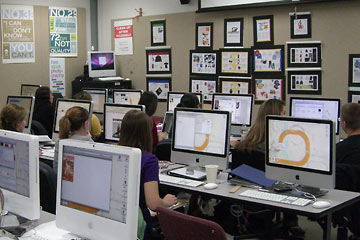
A couple of things struck me. First, the computer lab was brightly lit and the walls were covered with posters, artwork, and during the crit, of course, with student work. A student I talked with said that she'd been responsible for some of this, saying "how can we do creative work in a boring setting?"
I share this feeling, finding most computer labs to be dark, soulless places. Good for work, not so good for imagination. Ours at Cuyahoga Community College have completely neutral gray walls, countertops, etc. There's little space to put artwork on the walls.
The other thing that impressed me in the two classes—especially the Typogrpraphy crit—was the feeling of energy and participation among the students. Crits often are strained and tense, with most students sitting silently throughout. In Claudine's crit the students were talkative, collegial, mostly positive but appropriately critical. It was the most relaxed, free-flowing crit I've been in, and this certainly includes my own. Clearly Claudine has created an atmosphere in which students feel free to talk and share their ideas. The students being critiqued were non-defensive and genuinely seemed to appreciate the comments. This is the kind of atmosphere I strive for but rarely arrive at. It's not easy, and I applaud Claudine, her students, and perhaps the Chapman atmosphere overall, which may in some way contribute to this.
![]() What are your experiences with critiques, as a student or teacher? Hate them? Love them? Add your comment by clicking below.
What are your experiences with critiques, as a student or teacher? Hate them? Love them? Add your comment by clicking below.
Top |
|
i
![]()